ChartifyR
  • About
  • GitHub
  • LinkedIn
  • RSS

Stay in the loop

Get new tutorials delivered to your inbox.

On this page

  • Latest tutorials
  • View source
  • Report an issue
Categories
All (8)
code (7)
color (1)
dataviz (4)
dplyr (2)
ggplot2 (4)
news (1)
sf (1)
tidyverse (3)
R · Data Viz · Ecology

Turn data into clear, beautiful charts.

Hands-on tutorials for publication-ready charts, maps, and data pipelines in R, from ggplot2 and sf to tidy data wrangling.

Browse tutorials About Noah RSS
  • ggplot2
  • dplyr
  • tidyr
  • sf maps
  • palettes

Latest tutorials

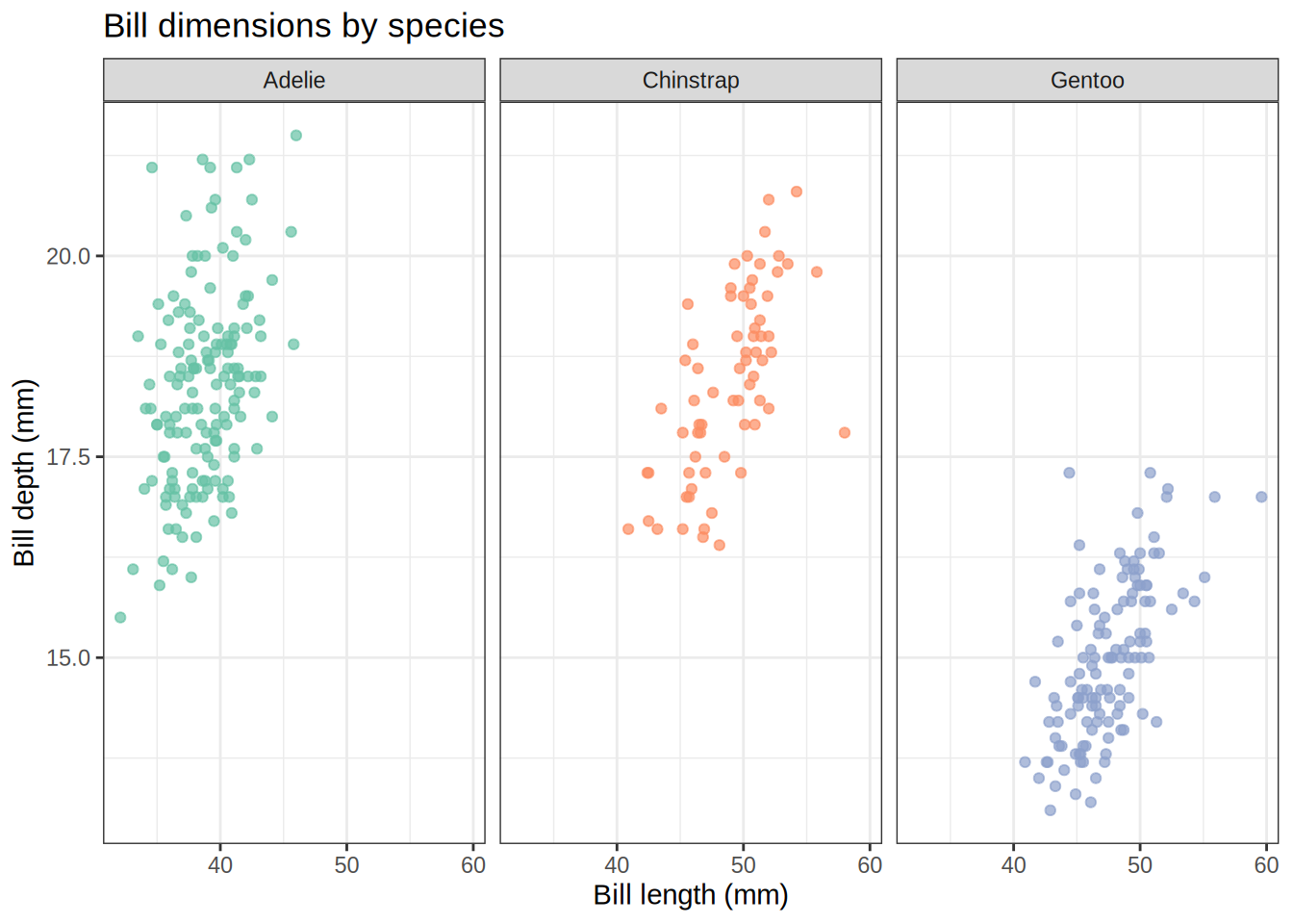
Multi-Panel Plots in R

Combining and faceting figures with patchwork, cowplot, facet_wrap, and facet_grid
code
ggplot2
dataviz

Learn four powerful approaches to multi-panel plots in R — use facet_wrap and facet_grid to split a single dataset by groups, or reach for patchwork and cowplot to stitch together entirely different figures into a polished layout.

Mar 28, 2026
11 min

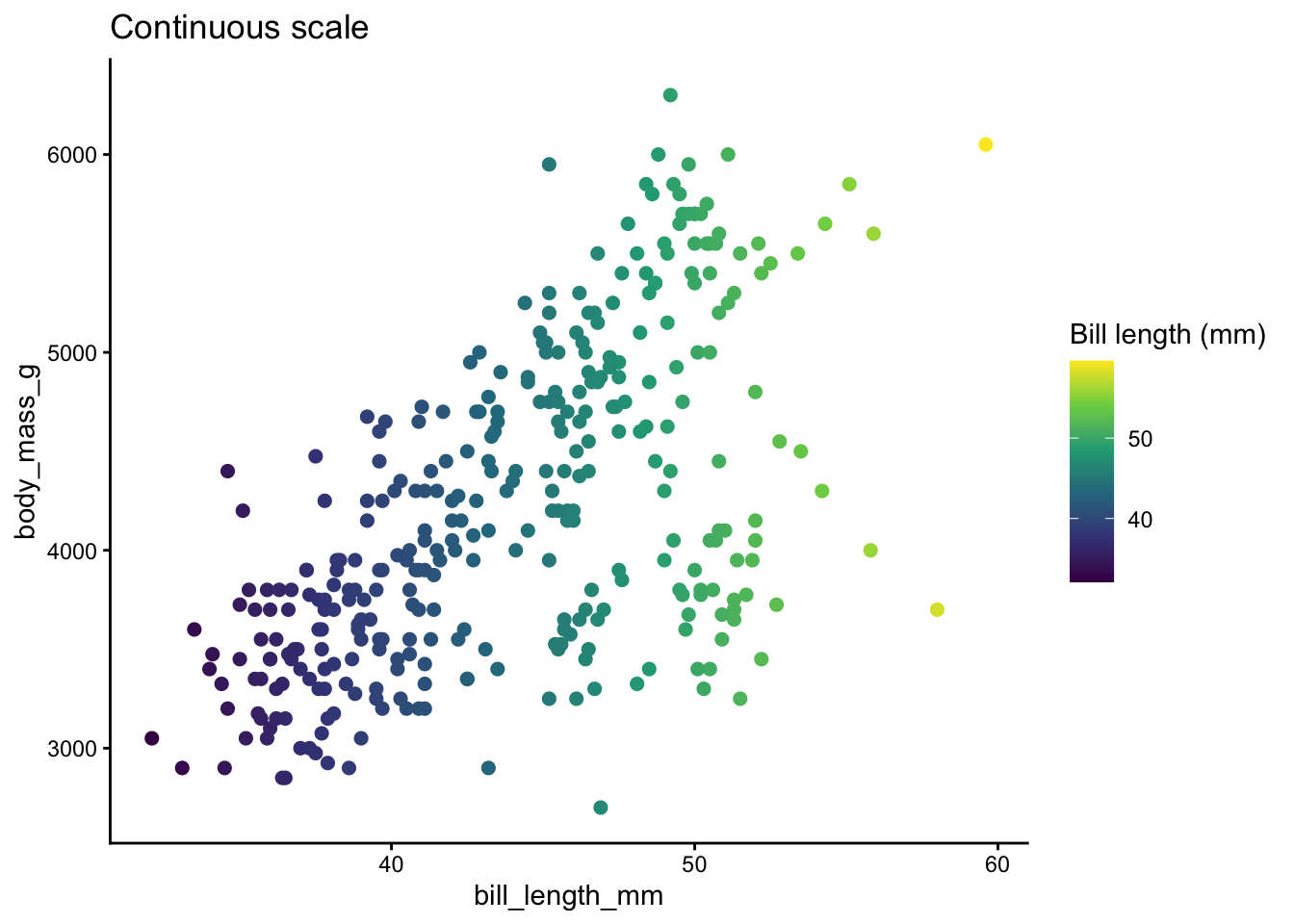
Everything Palettes in R: Viridis, Brewer, and Beyond

A comprehensive guide to color palettes in ggplot2
code
ggplot2
dataviz
color

Master color palettes in ggplot2 — from viridis and RColorBrewer to MetBrewer, wesanderson, and more. Learn when to use continuous vs discrete scales, how to design for colorblind accessibility, and how to avoid common pitfalls.

Feb 24, 2026
19 min

Mastering Joins in dplyr

Understanding left_join, inner_join, full_join, and common pitfalls
code
dplyr
tidyverse

Learn how to combine datasets with dplyr joins — left_join, inner_join, full_join — and how to diagnose duplicate rows, missing keys, and NA surprises.

Feb 25, 2025
8 min

Data Cleaning in the Real World

From messy CSVs to analysis-ready tables with tidyr and stringr
code
tidyverse

Learn how to reshape, split, and clean messy data using tidyr and stringr — pivoting, separating columns, pattern matching, and handling common gotchas.

Feb 22, 2025
8 min

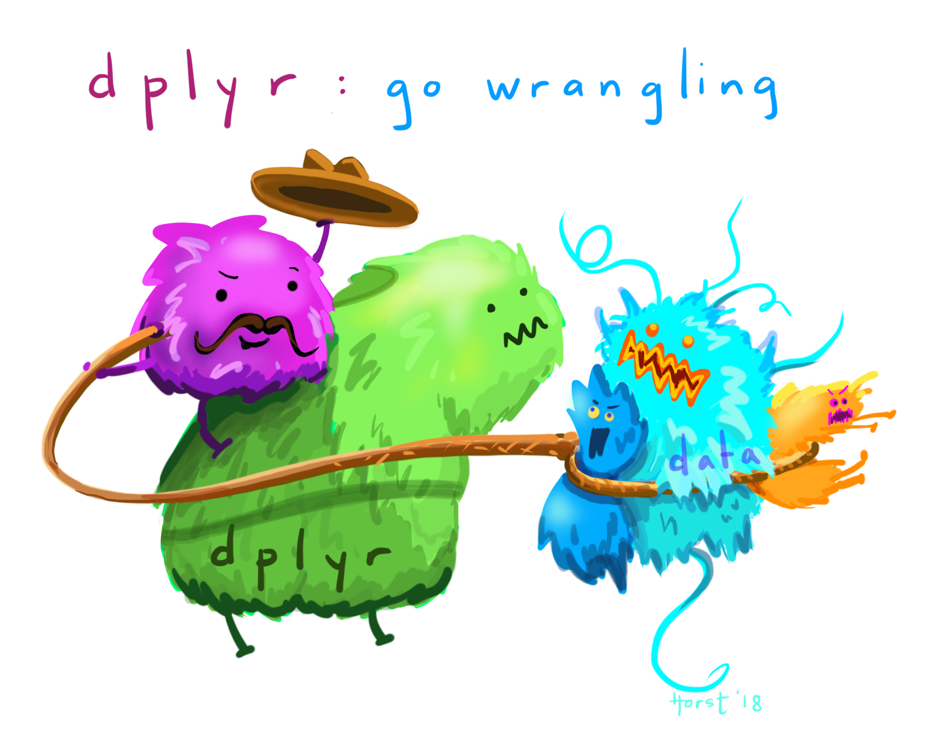
Basics of dplyr

A beginners guide to data wrangling in R
code
dplyr
tidyverse

Learn the core dplyr verbs — filter, select, mutate, arrange, summarize, and group_by — using the Palmer Penguins dataset.

Feb 15, 2025
4 min

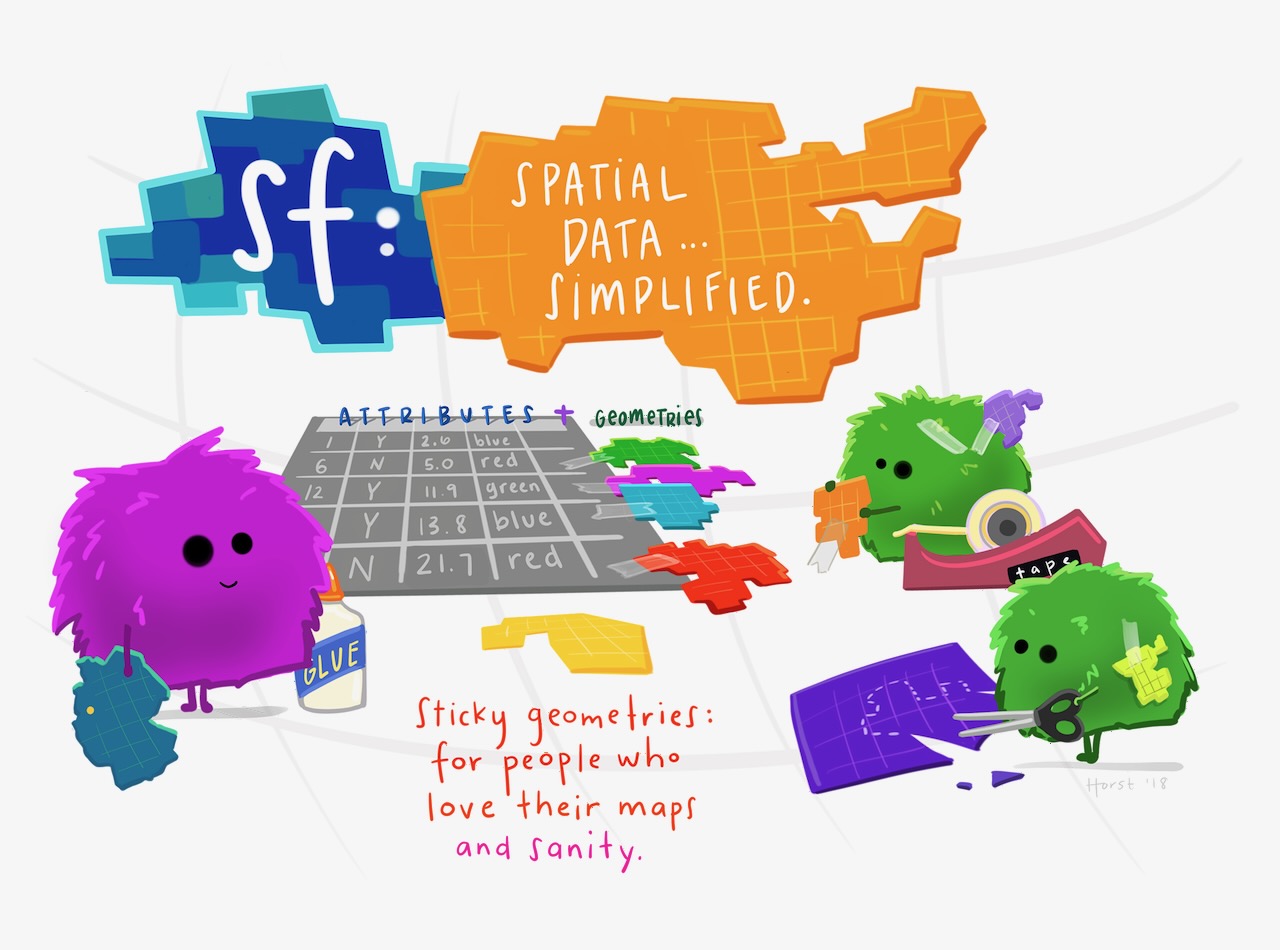
Mapping with ggplot2 and sf

A simple guide to creating elegant maps in R
code
ggplot2
dataviz
sf

Create beautiful maps in R using ggplot2 and the sf package — from basic polygons to customized choropleth maps with scale bars.

Feb 14, 2025
3 min

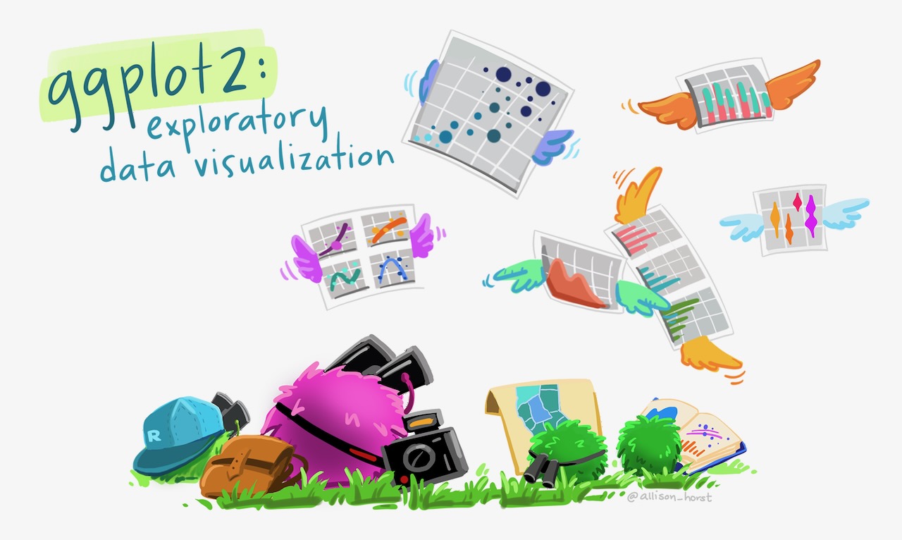
Basics of ggplot2

A beginners guide to making figures in R
code
ggplot2
dataviz

Learn the fundamentals of ggplot2 — from basic histograms to colorful, labeled figures using the Palmer Penguins dataset.

Feb 13, 2025
4 min

Welcome To ChartifyR

news

Introducing ChartifyR — a space for sharing data science and visualization techniques using R and the tidyverse.

Feb 10, 2025
1 min
No matching items
Back to top

ChartifyR
R, data viz, and ecological storytelling.
© 2026 Noah Weidig

Home · About · RSS

  • View source
  • Report an issue


Built with Quarto